%201.png)


Why Custom Homes Shouldn’t Be Designed Like a Pinterest Board
Why Custom Homes Shouldn’t Be Designed Like a Pinterest Board

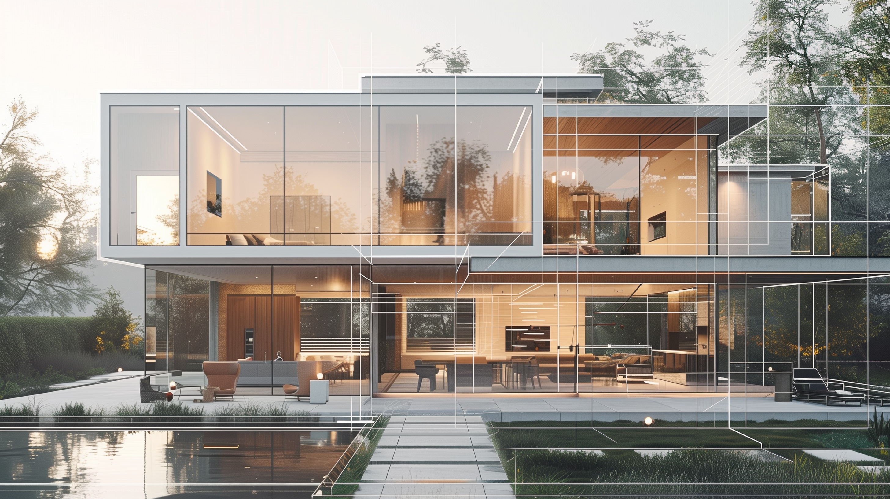
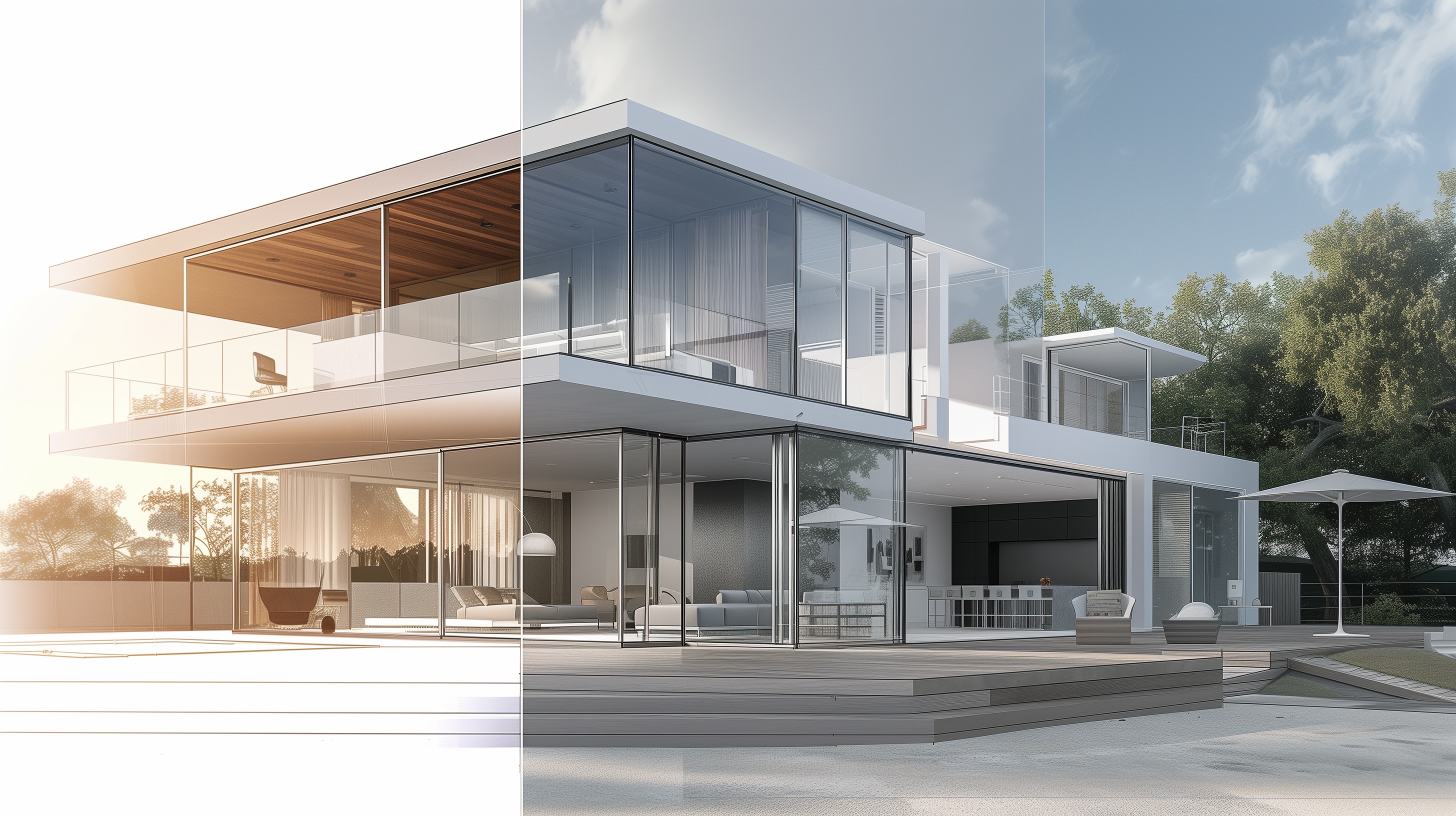
Pinterest is a great place to gather ideas. It is not a design method. When a custom home is assembled from disconnected images—one trendy kitchen, a different staircase, five clashing bathroom ideas—you get a Frankenstein house: pretty parts that fight each other, date fast, and are harder (and costlier) to build well.
At Homes by Westgate, we start with one clear concept and let every decision serve it. Here’s how to protect originality and cohesion from day one.
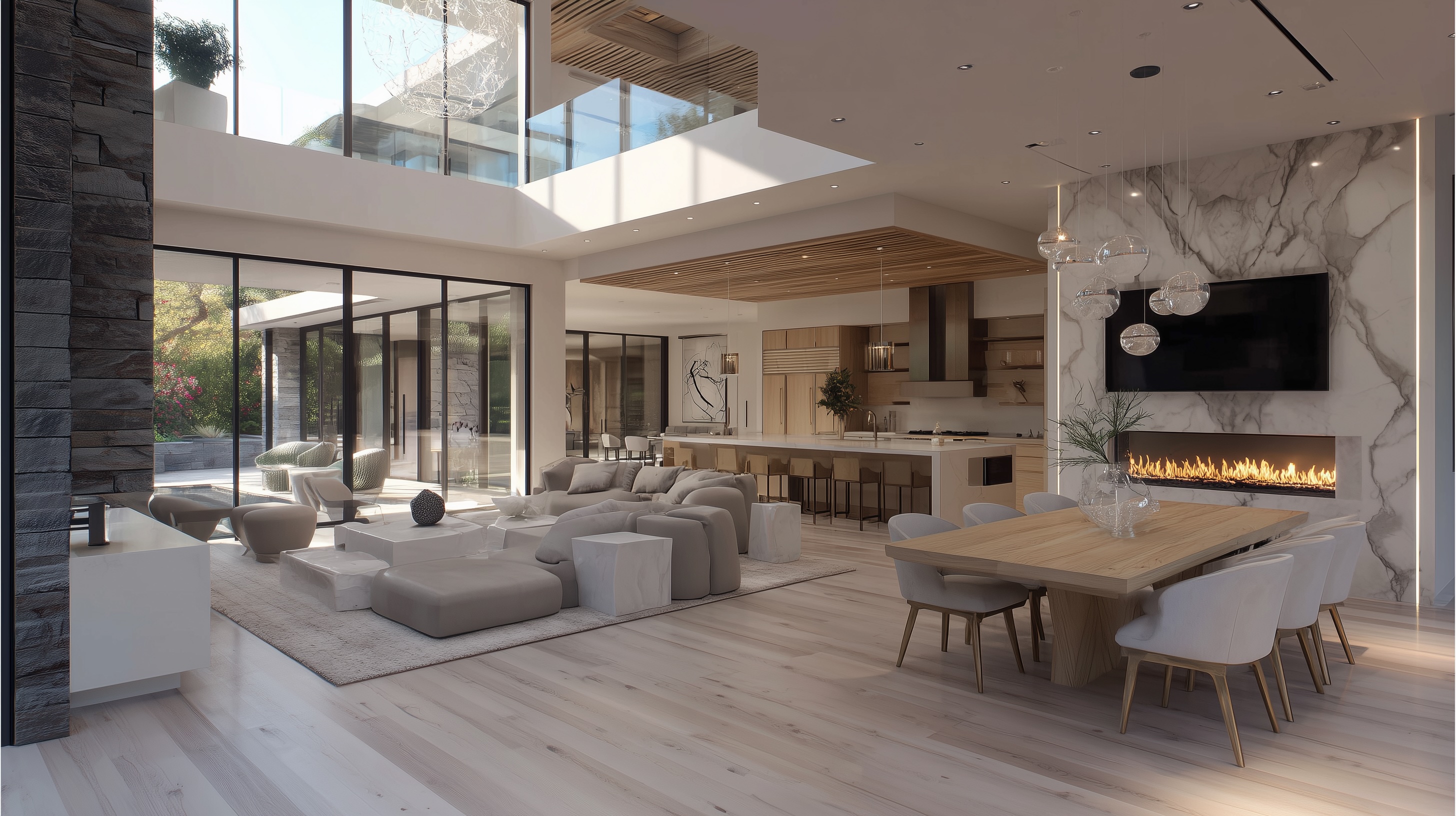
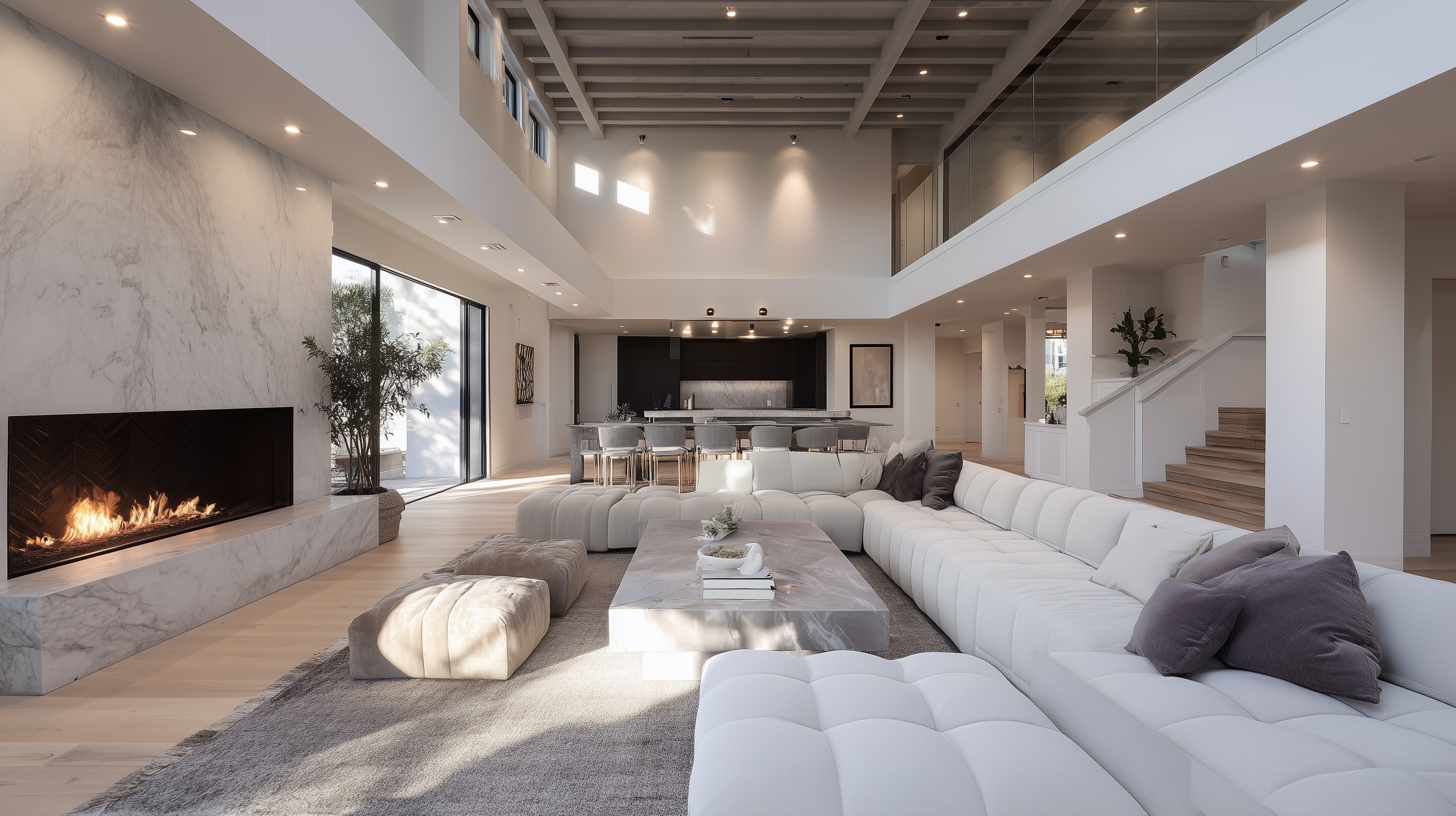
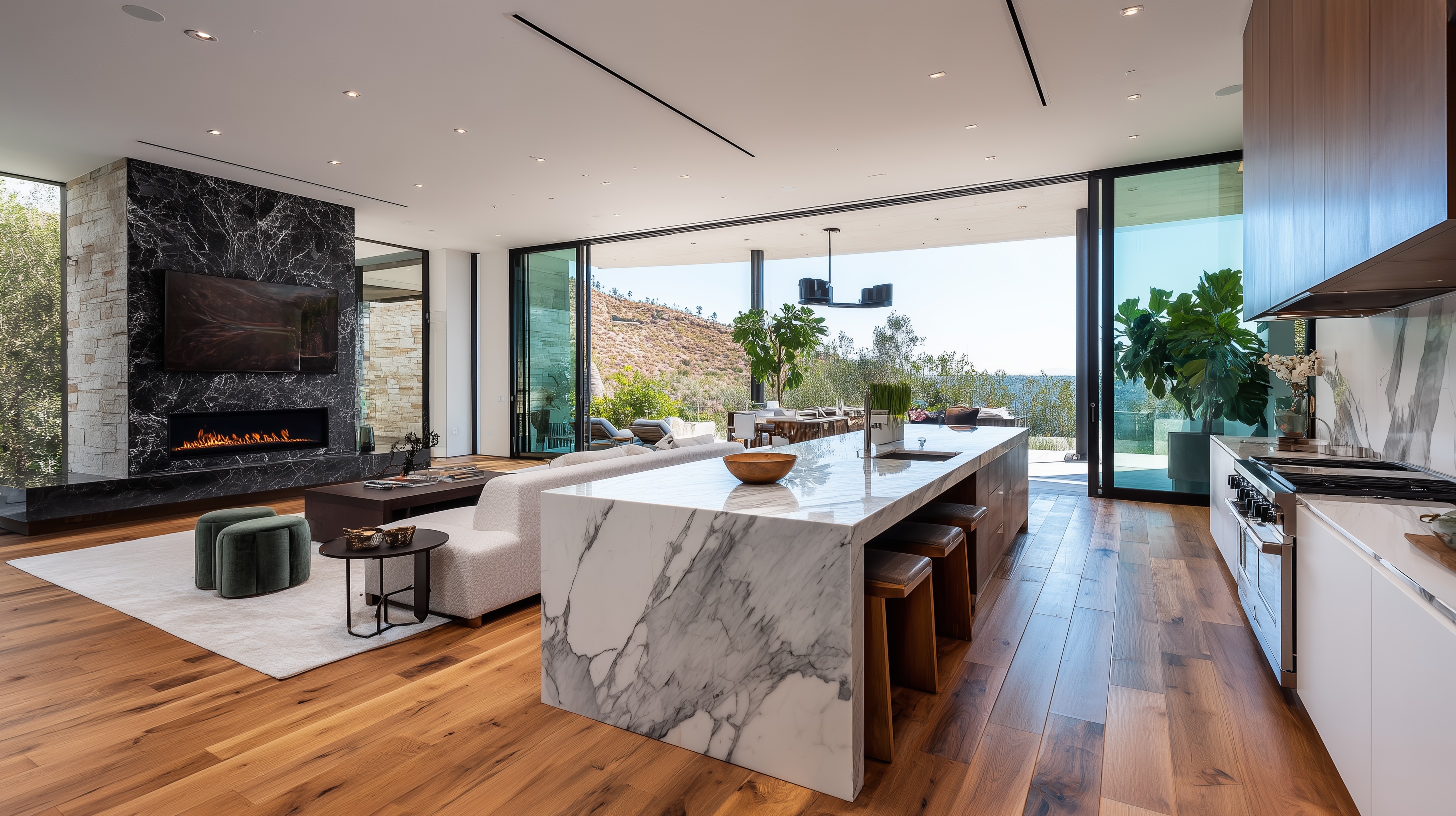
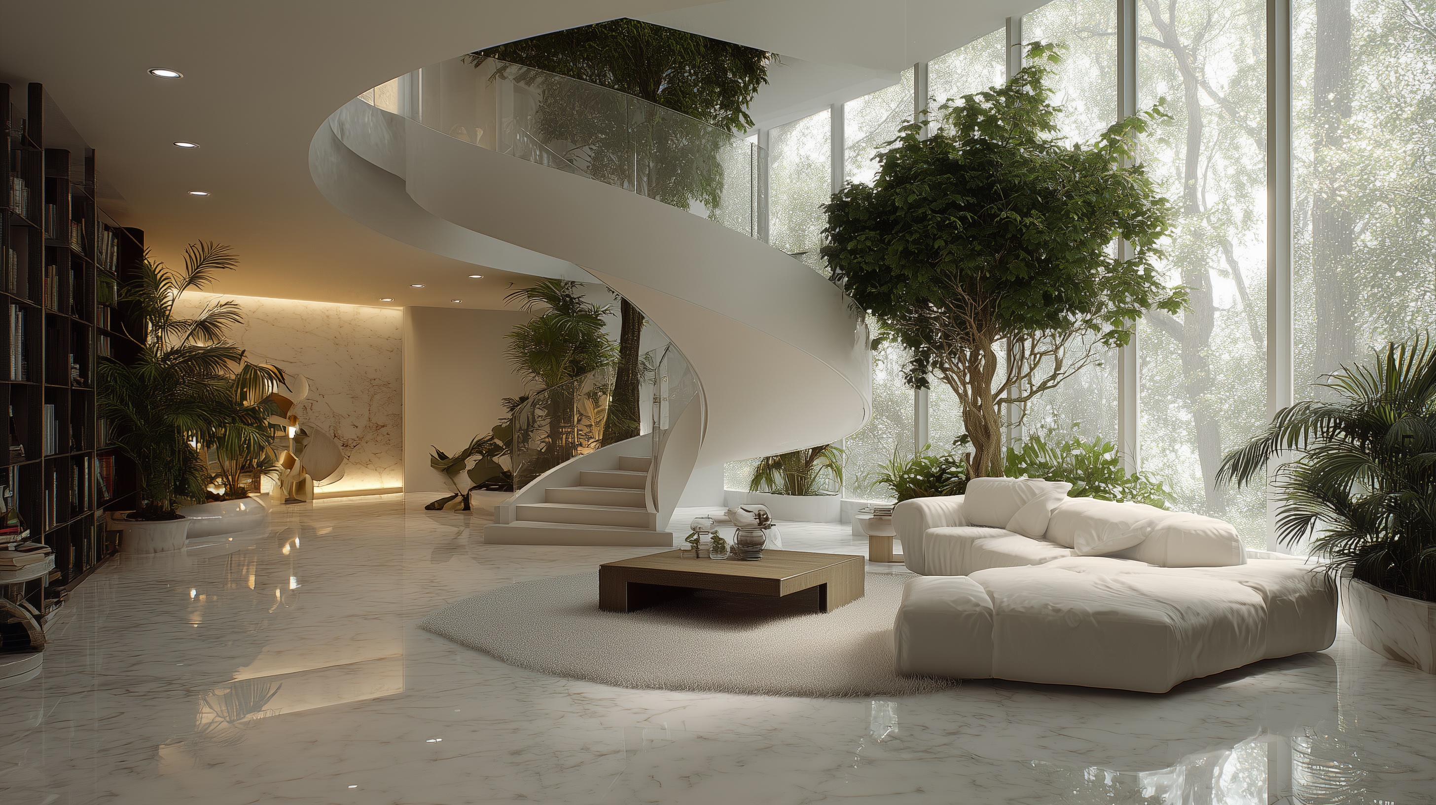
The Problem with “Collage Design”
- Trends over timelessness
Screens reward novelty; houses reward longevity. What pops on a feed often ages in months. - No hierarchy
When everything is a “moment,” nothing is. Homes need quiet backdrops and a few intentional highlights. - Material noise
Too many species, stones, metals, and profiles create visual static—and fussy maintenance. - Function last
Rooms get forced to fit images rather than your site, climate, and daily rituals. - Construction complexity
One-off details in every room blow budgets and timelines. Repetition is where craft and value compound.
Start with a Thesis, Not a Mood
A design thesis is a simple statement that aligns architecture, interiors, and landscape:
- “Calm, light-led living oriented to the garden.”
- “A stone spine with warm timber planes that frame the view.”
- “Soft minimalism—tactile, quiet, easy to live in.”
This thesis becomes the yardstick: Does this decision serve the idea? If not, it’s out.
Seven Frameworks That Create Cohesion
- Proportion & Grid
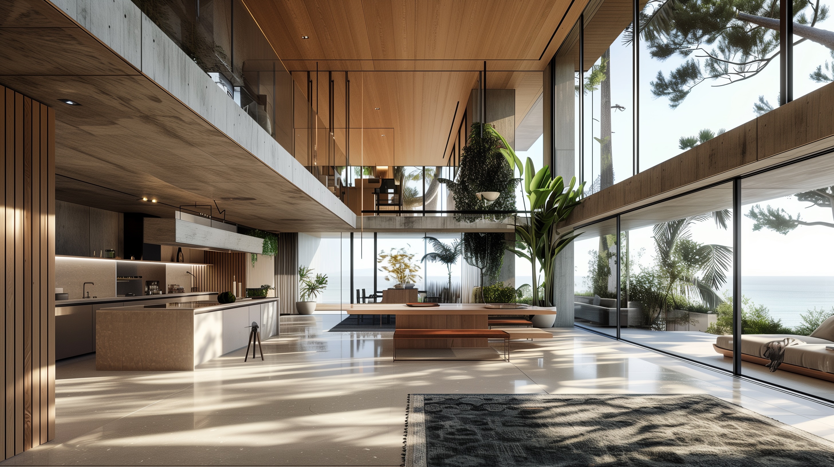
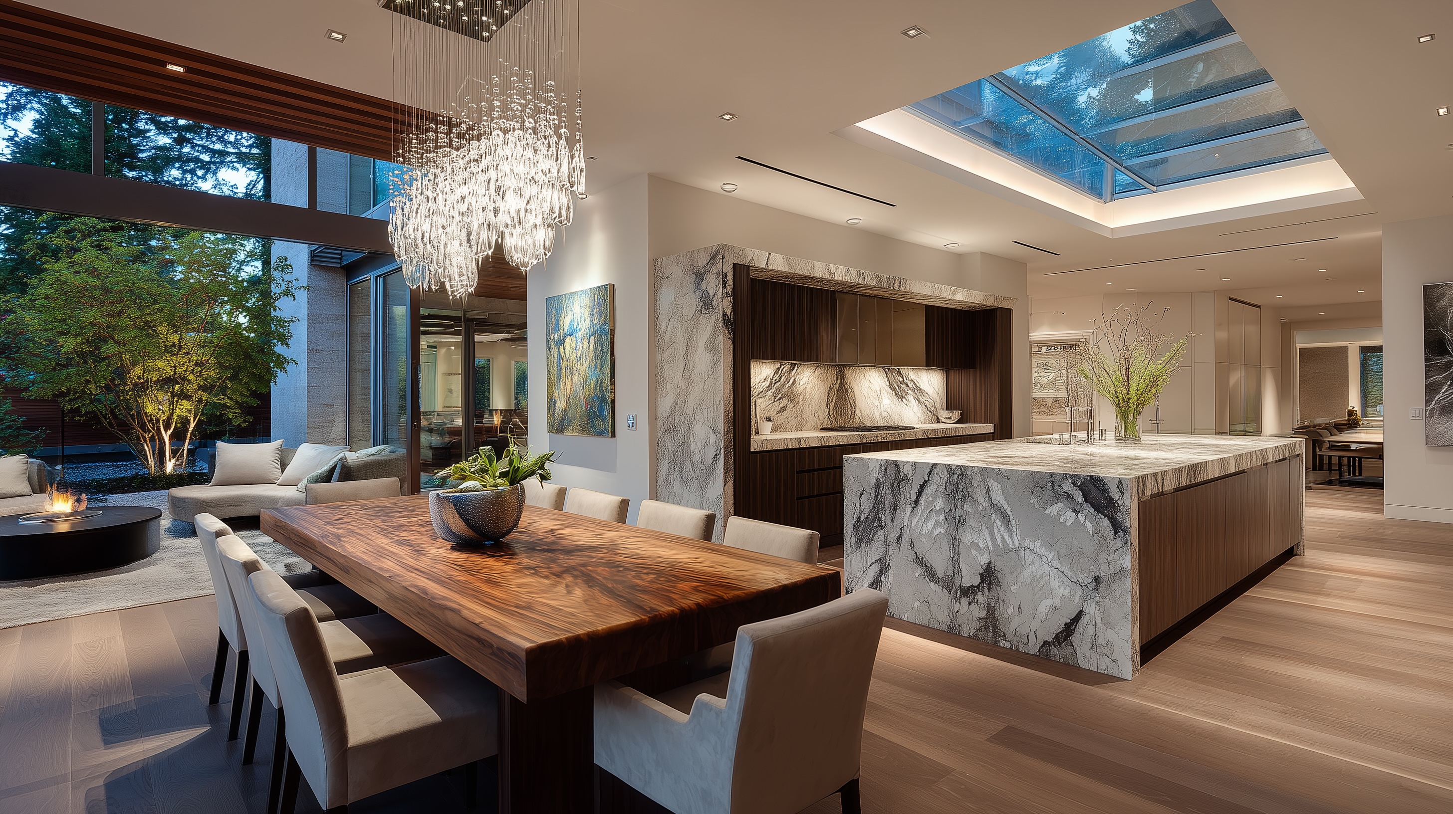
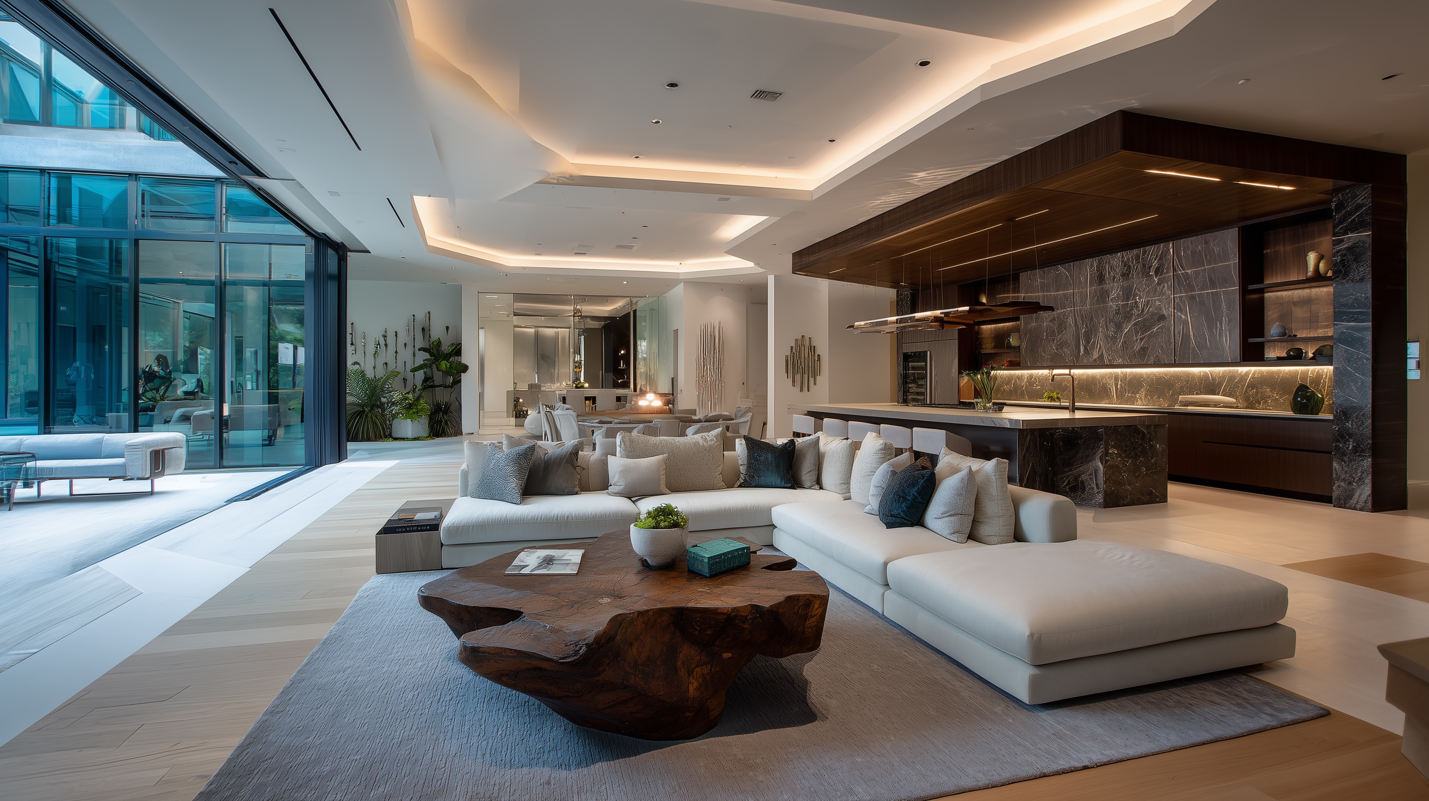
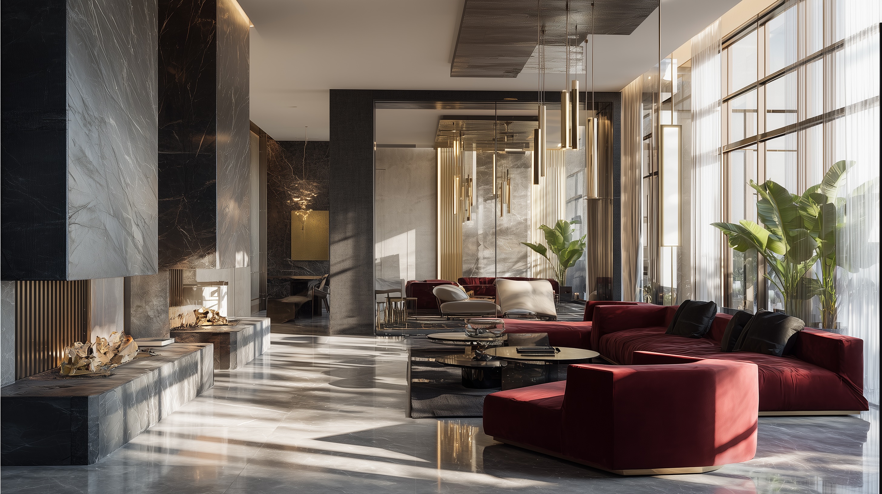
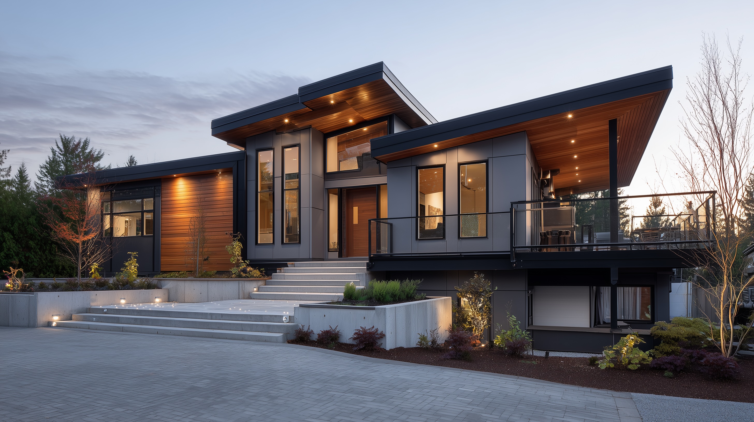
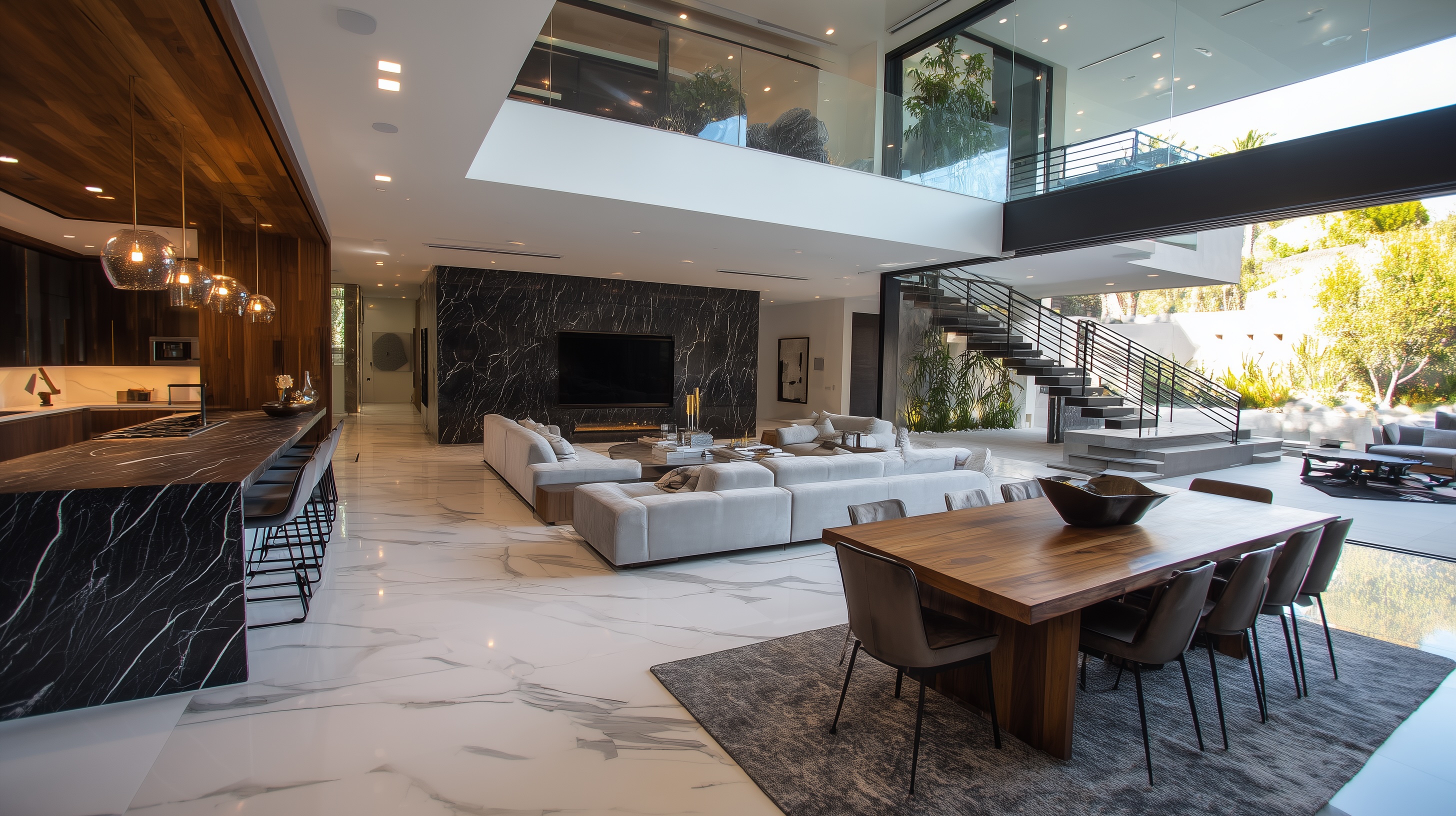
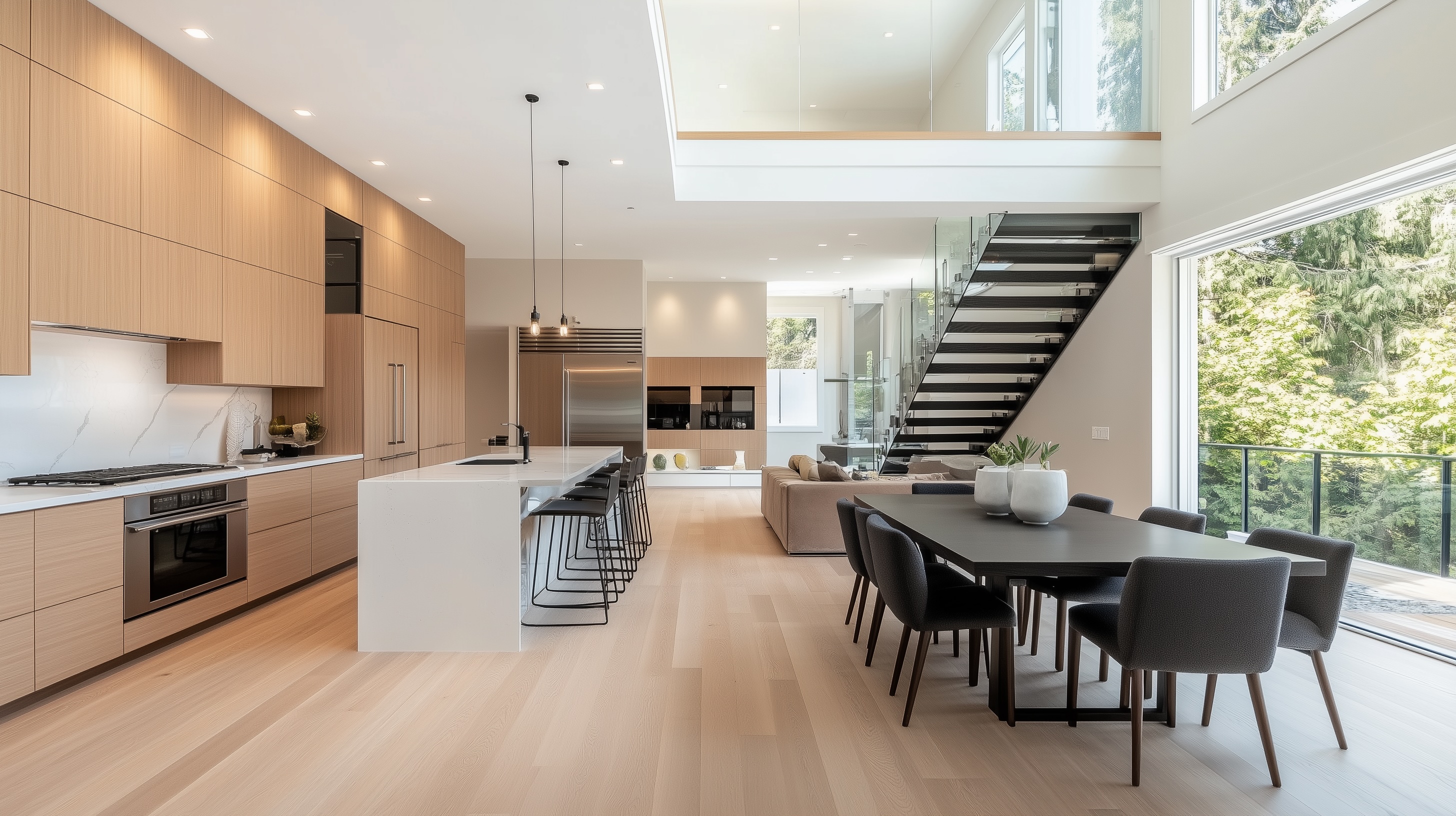
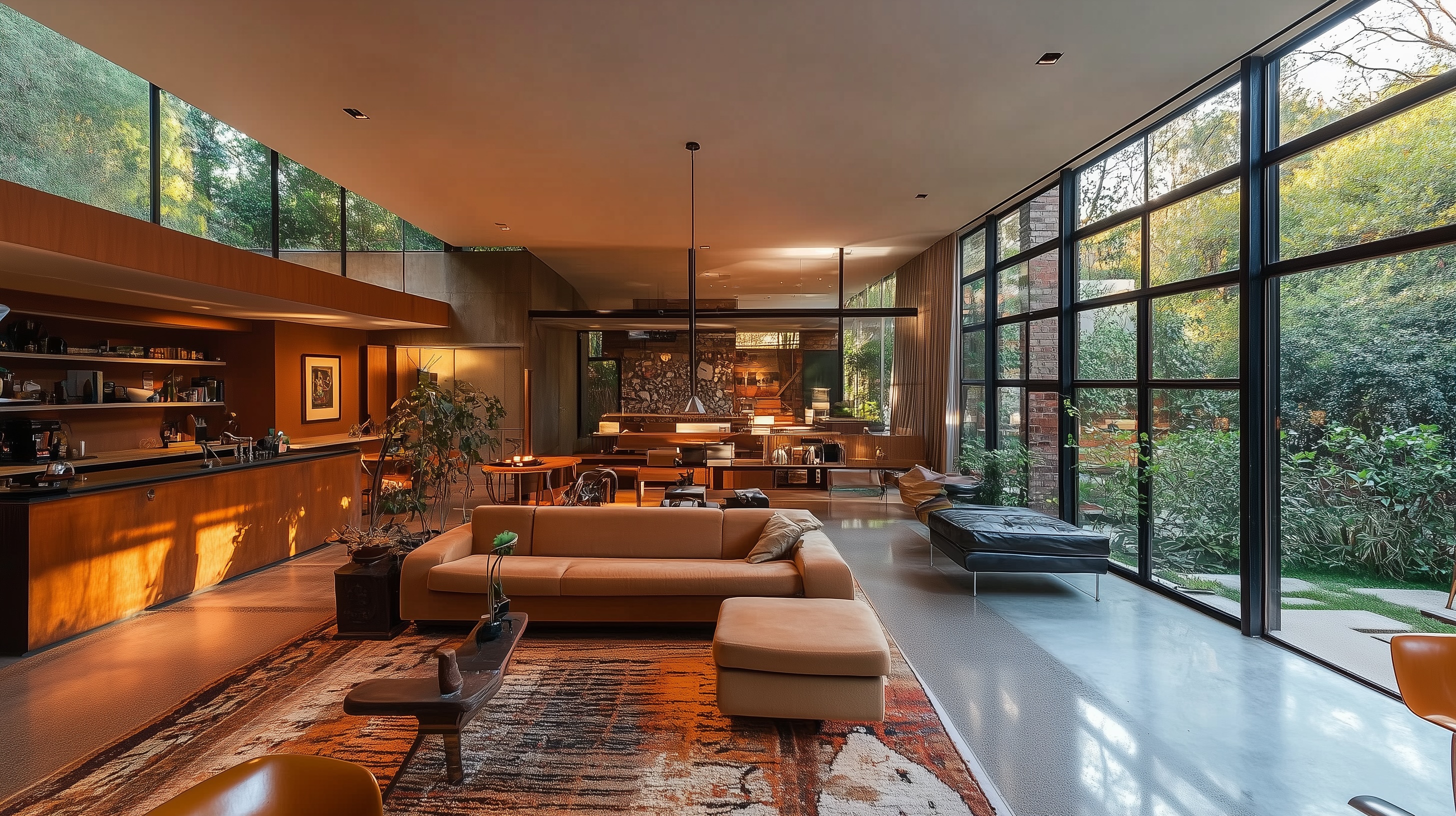
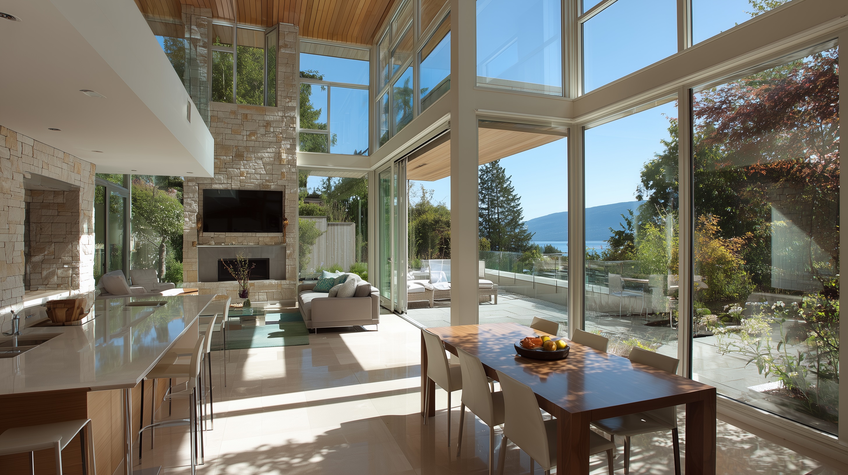
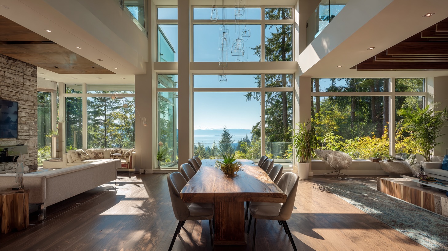
Establish a module (e.g., 4' / 1,200 mm). Align windows, cabinetry, tiles, and lighting to it. Grids are invisible editors that make spaces feel composed. - Material Palette Discipline
Choose a primary trio (for example: oak, limestone, matte black). Repeat them inside and out; add one restrained accent. Consistency beats variety. - Detailing Language
One reveal size, one casing profile, one corner radius, one grout width. Micro-consistency creates macro-calm. - Rhythm & Repetition
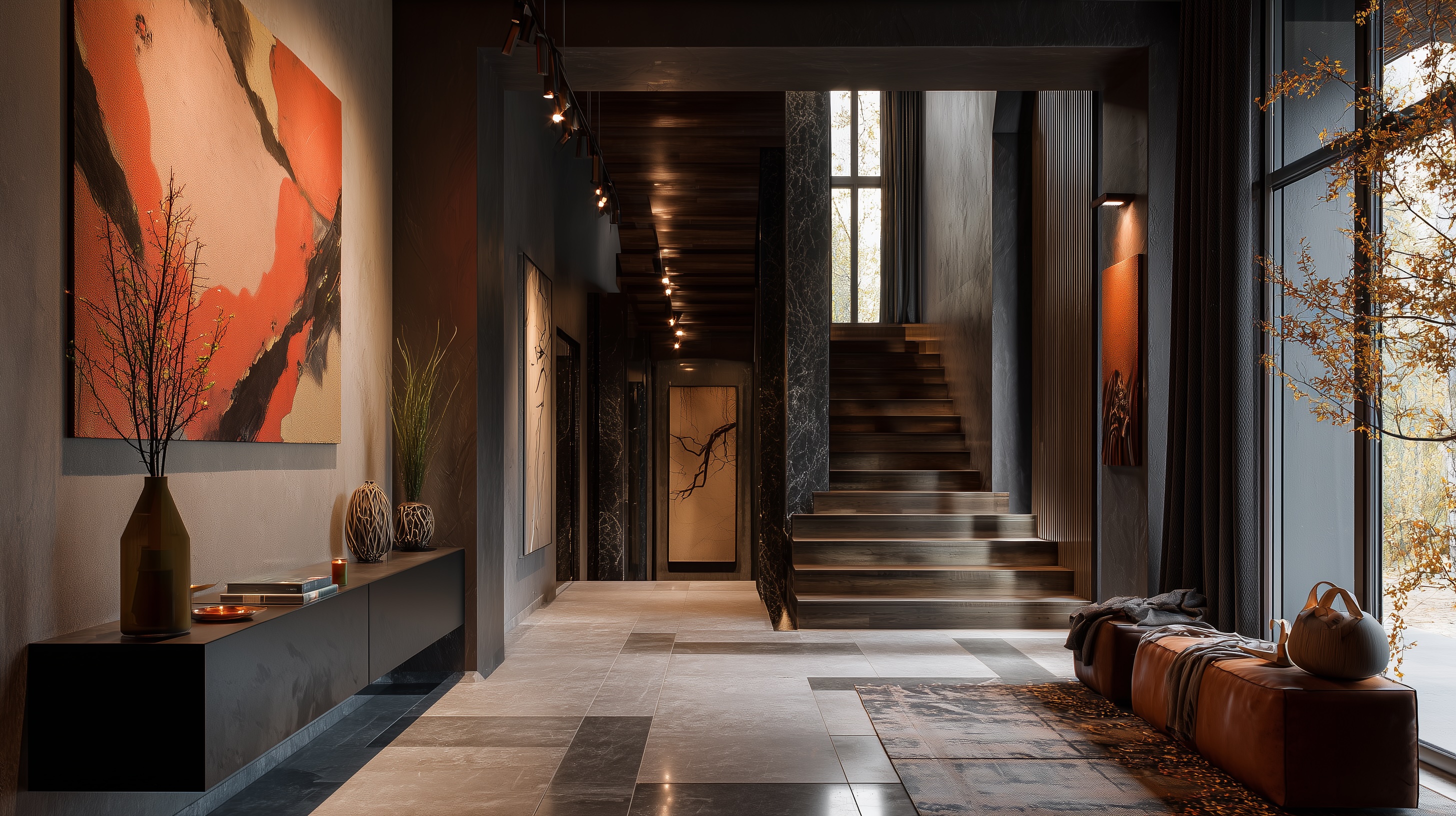
Repeat jamb depths, plinth heights, fixture finishes. Repetition is how a home reads as one idea instead of many. - Hierarchy
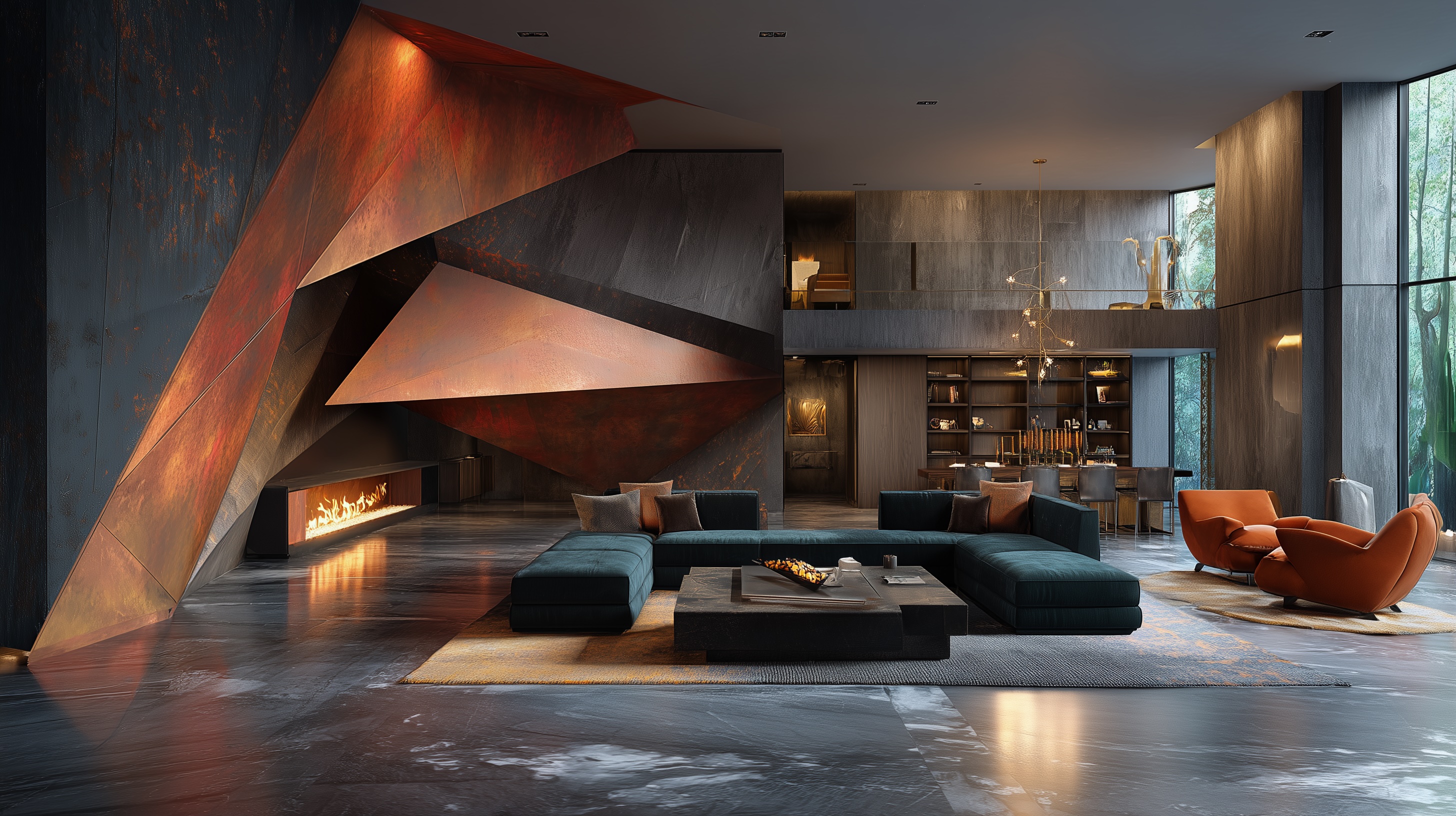
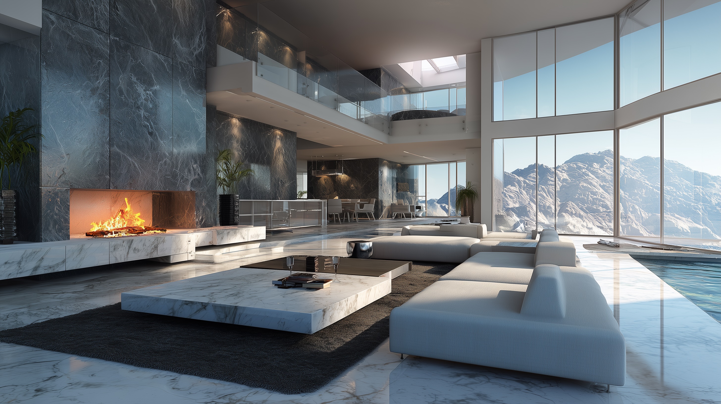
Decide your hero moments (entry, stair, hearth). Let surrounding spaces support, not compete. - Light as a Material
Choose color temperature bands (e.g., 2700–3000K), conceal glare, and aim for even, layered lighting. Light ties the house together. - Landscape Integration
Materials, axes, and thresholds should carry through to terraces and gardens. Homes feel original when they belong to their site.
How to Use Pinterest the Right Way
- Pin by purpose, not by product
Caption why you like an image: “filters west sun,” “soft acoustics,” “hands-free mudroom flow.” - Look for patterns
Do your favorites share massing moves, material weight, or light quality? That’s your language. - Make a “no-go” list
Be explicit about what you’re not doing (busy veining, mirrored metals, faux beams). Guardrails prevent drift. - Nominate a curator
One decision-maker (with your architect/builder) filters all new ideas through the thesis. - Prototype early
Approve full-scale mockups (vanity corner, stair tread, jamb detail). Seeing it beats imagining it. - Set freeze points
Lock key packages (windows, millwork, tile) in a sensible sequence so late additions don’t unravel cohesion.
Process That Protects Originality
1) Discovery → Design Brief
We translate inspirations into a written thesis, adjacency goals, and a first-pass palette—rooted in your site and lifestyle.
2) Concept → One Vocabulary
Architecture leads; interiors and landscape amplify the same moves. No competing agendas.
3) Materials → Rule of Three
We assemble a physical kit of parts. New materials must earn their place by serving function and thesis.
4) Governance → The Design Bible
A living document (profiles, alignments, finishes, lighting temps) that everyone builds from—no freelancing.
5) Build → Mockups & QA
On-site prototypes, photo logs, and checklists ensure the details you approved are the ones we build—repeatably.
Two Quick Vignettes
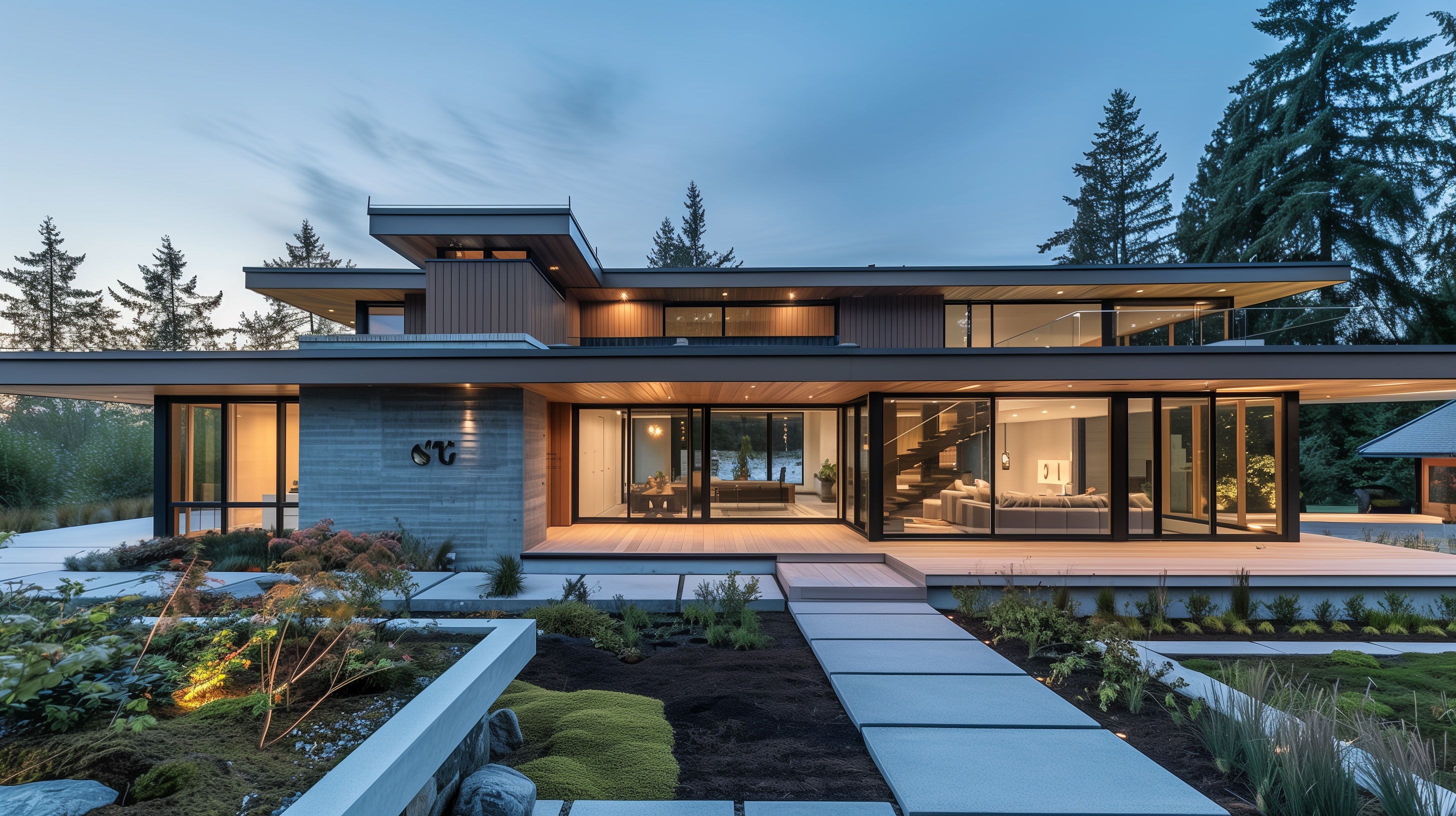
The Calm Garden House
Thesis: “Light, garden, silence.”
Moves: Low, horizontal massing; deep window jambs; oak + limewash + basalt; concealed hardware; 2700K lighting.
Result: Tranquil, timeless, easy to live in.
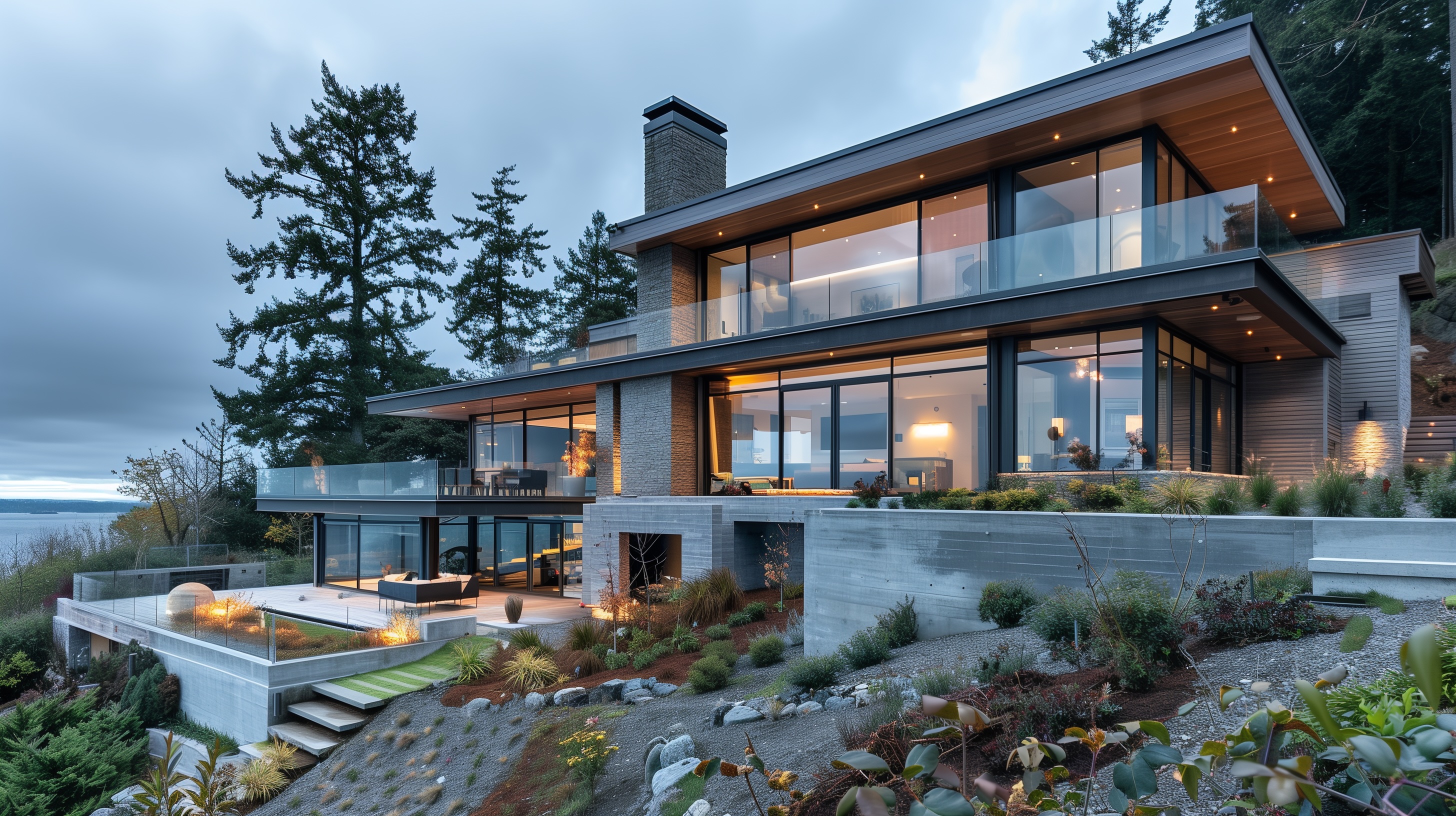
The View-Framing Retreat
Thesis: “Stone spine, timber planes.”
Moves: One material anchor; repeated 4" reveals; bronze only at touchpoints; glazing aligned to a single datum.
Result: Powerful, simple, unmistakably itself.
The Payoff
- Spaces that feel calm and intentional
- Details that age gracefully, not trend-chase
- Smoother construction and better value through repetition
- A home that photographs well because it lives well
Homes by Westgate: Your Editor-in-Chief
Bring us your board—we love good references. Our role is to protect the big idea: translate inspiration into a disciplined, site-led design and build it with the care that cohesion demands.